

YOUR DATA.
INSTANT ANSWERS.
AI-powered insights for school leaders.
Stop chasing spreadsheets. Simplicity Education unifies your data, delivers AI-powered insights, and helps leaders focus on what matters most: running schools and improving student outcomes.
All schools have data.
Few have answers.
Critical informations lives across systems. The result: reports take too long, data is inconsistent, and leaders discover problems too late.
Simplicity changes that.
We bring all of your data together so you can get the answers you need when you need them.
Everything leaders need. All in one platform.
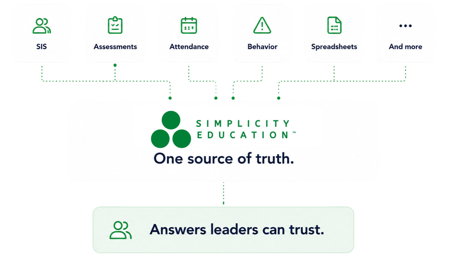
1 . Centralize
all your data
We integrate and model data from across your systems, creating a trusted foundation for reporting, analysis, and AI.
Attendance.
Grades.
Assessments.
Behavior.
Enrollment.
Student support.
Custom data sources.
Because AI is only as good as the data behind it.

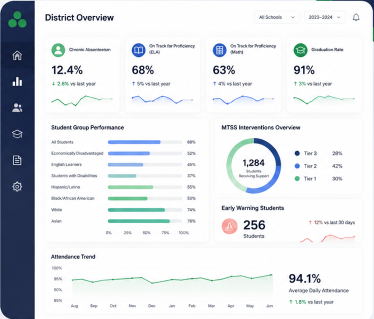
2 .Dashboards designed for schools
SimplySpark dashboards help leaders monitor school health, spot trends, and uncover risks earlier.
Review data in one place to better understand:
Academic performance
Student groups
Attendance + behavior
School health
Custom dashboards

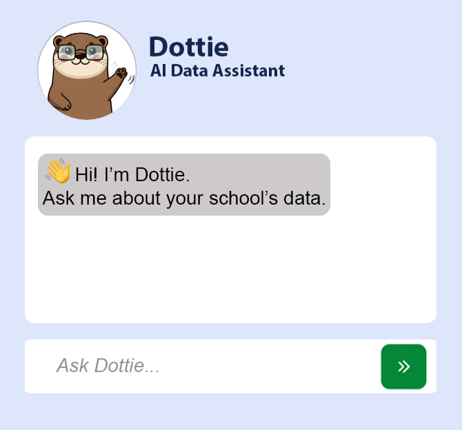
3 . Ask Dottie
Your AI Data Assistant
Dottie transforms school data into conversation.
Ask questions in plain English and receive immediate answers, charts, and tables generated directly from your organization's data.
No SQL.
No exports.
No waiting for reports.
Just answers.

4 . Lead with
confidence
Use trusted data to drive decisions across every part of your organization.
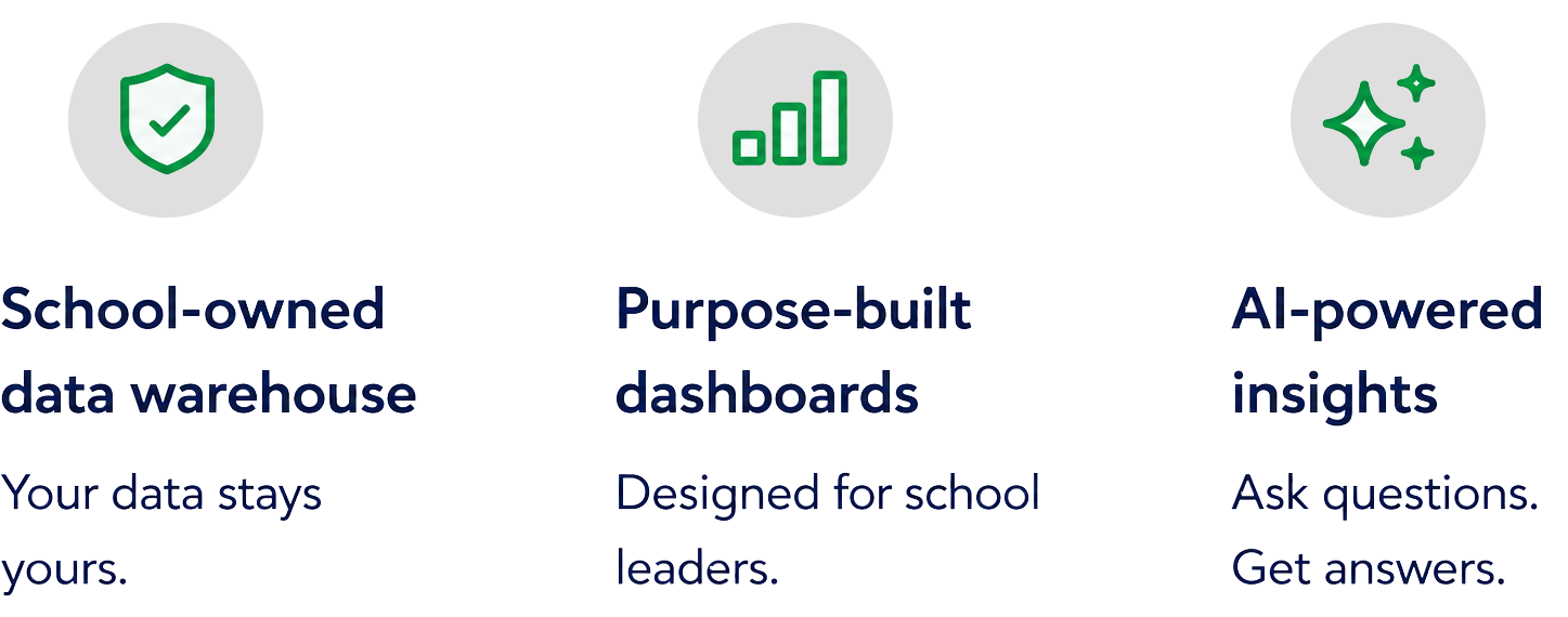
Purpose-built dashboards
SimplySpark makes it easy to monitor the metrics that matter most with visualizations designed specifically for school leaders.
AI-powered insights
Ask any question and get instant answers, visualizations, and insights directly from your school's data.
Dynamic student profiles
See the whole student, not just isolated data points, with profiles that bring together academic, attendance, behavior, and support information in one place.
Board reports made easy
Use consistent, data-rich reports to update your board without chasing down your KPIs.

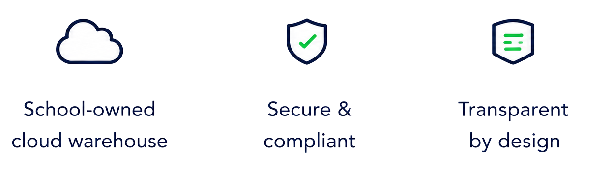
Your data stays yours.
Simplicity is built on a foundation of trust and transparency.
Your organization's data lives in your cloud environment-most often Google Cloud-so you maintain full ownership, control and visibility.
Run schools,
Not spreadsheets.
Join our growing community of customers using Simplicity to centralize data, uncover insights, and make better decisions every day.